
Why Bounce Rate is a Symptom, Not the Disease
High bounce rates serve as important plot points instead of being considered villains. Users who exit pages without taking action demonstrate that something on the page did not match their stated desires. The bounce signals to users that the provided content or design speed or overall experience did not satisfy their needs. The page required excessive time to finish its load process. The page executed its response too slowly to satisfy the users' questioning needs. The page possibly failed because it attempted so intensely that it confused users beyond comprehension. Bounces do not occur randomly because they stem from combinations of cognitive biases and both noticeable and subtle points of friction that make users want to leave.
It makes better sense to identify the cause of bounce rates than to focus only on their numbers. What’s breaking the flow? Where does friction creep in? What makes a user stay? The reduction of bounce rates depends on delivering smooth user experiences that prevent visitors from leaving because the experience meets their needs perfectly. This blog explains strategic UX approaches that will ensure user engagement and draw users to return repeatedly.
Understanding Bounce Rate in Context
The reputation of bounce rate remains negative. People often view high bounce rates as warning indications that their site contains serious issues. The measurement of bounce rate contains incomplete data since different types of bounces produce varying results which makes overemphasis on this metric misleading. You should understand how bounce rate communicates its messages before attempting universal website changes.
The Perception of Bounce Rate
When someone comes to your blog website they will read the complete material before departing. Is that a failure? Not necessarily. A visitor accomplishes their mission when they intend to get an answer and successfully receive it. Single-page landing pages including those meant for one specific activity such as subscription signups or resource downloads lead visitors to leave instantly. A high bounce rate in such situations shows users succeeded in finding rthe equired information without continuing their exploration.
What signs indicate that elevated bounce rates should be considered actual problems? To identify problems you should examine bounce rates within their broader context. User behavior becomes easier to understand when you analyze session duration against scroll depth alongside interaction rates. Such a situation occurs when your website experiences numerous quick exits while visitors remain on the page for a short amount of time. That’s a problem. Your content's duration of consumption during a visit should be seen as part of normal user interaction patterns when users depart within two minutes. Google Analytics together with heatmaps and session recordings enable you to identify between negative bounces that create frustration and abandonment of users versus successful page exits that indicate users got what they wanted.
UX Pitfalls That Drive Users Away
All bounces do not necessarily pose dangerous risks. Several warning signs that represent weak UX appear as loud indicators of poor design. Several main factors lead to user defections.
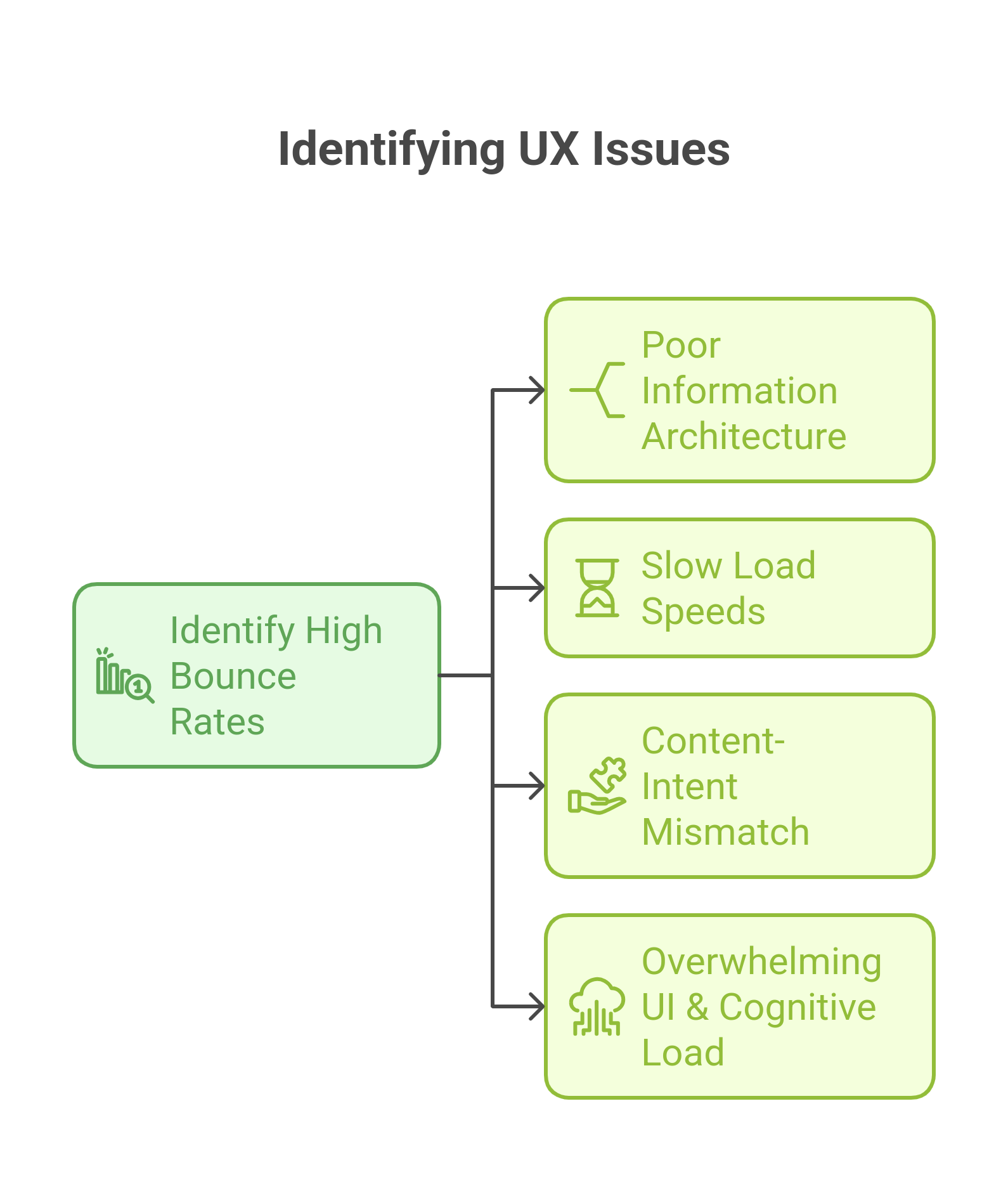
Poor Information Architecture
People will leave rather than put in effort to locate content on a site. Users abandon websites when navigation becomes ambiguous or essential content gets hidden deep below the surface or when pages lack clear organizational structure. Users who cannot identify their search items immediately during a visit automatically leave the website.
Slow Load Speeds
Page loading speed exceeds typical expectations so users demand it for their maximum satisfaction. Research confirms that every 100ms delay raises bounce chances by a small amount. The current user standards demand instant page loading so any response time longer than 3 seconds starts putting your website at risk. Page loading speeds and user experience can significantly improve through image optimization and script cleanup along with caching implementation.
Mismatch Between User Intent & Content
Users tend to find content that does not match their original search criteria before they choose a new page to explore. Searching for “best running shoes” leads users to a hiking boots product page instead of their intended results. Frustrating, right? Page expectations never meet search query ad or referral expectations leading users to quickly leave your site. Content that delays its promised value makes users leave without spending time deciphering what they obtained.
Overwhelming UI & Cognitive Load
The capability to add one million elements does not warrant their actual implementation. The combination of excessive text messages with multiple CTAs and competing pop-ups produces cognitive overload for users. People who experience information overload during the user experience choose to abandon rather than figure out the content. A clean UI combined with visual accessibility functions as the foundation for retaining users.
Advanced UX Strategies to Reduce Bounce Rates
Small modifications in design alone fail to decrease bounce rates. UX designs that replicate user expectations while reducing friction and building engaging interactions make people stay on websites. The following discussion details fifteen elevated UX techniques that direct users to remain on the site.
Optimizing First Impressions: Above-the-Fold Engagement
The user makes their stay-or-go decision through nearly immediate response. Online visitors form their initial reactions about your webpage within half a second so the content that appears above the visible area functions as a critical element.
The 3-Second Rule: Communicating Value Instantly: Three essential questions about your page must present clear answers to visitors who visit your site within a three-second period.
- What is this page about?
- Why should I care?
- What should I do next?

Example: The Dropbox homepage shows visitors an immediate summary that states—"Get to work, with a lot less work." No confusion, no clutter, just instant clarity.
The delivery of a value proposition that addresses user needs directly should form part of your implementation strategy. The page requires one dominant call-to-action because it should be the most noticeable feature on the screen.
Eliminating Cognitive Overload: Users don’t process information linearly—they scan. Too many competing elements (dense text, excessive animations, multiple CTAs) create decision fatigue, increasing bounce rates.

Example: Google’s homepage is a masterclass in cognitive simplicity. It presents one primary action (search) with minimal distractions.
Implementation Tip: Use a clean, structured layout with ample whitespace and minimal distractions. Keep headlines concise and informative, ensuring they communicate value at a glance.
Speed Optimization Beyond the Basics
Slow websites kill engagement. Research by Google shows that as page load time increases from 1s to 5s, the probability of a bounce increases by 90%. However, optimizing speed isn’t just about loading times—it’s about when users can start interacting.
Optimizing Time to Interactive (TTI): TTI measures when a page becomes fully interactive, not just when it loads visually. A page that appears loaded but lags when users try to scroll or click creates frustration.
Example: Amazon optimizes its server response times and defers non-essential scripts, ensuring that key interactive elements load first.
Implementation Tip: Defer JavaScript that isn’t essential for initial rendering, prioritize above-the-fold content, and use a content delivery network (CDN) to distribute assets efficiently.
Using Next-Gen Image Formats: Images often account for over 50% of a page’s weight. Using WebP and AVIF instead of PNG or JPEG reduces file sizes by up to 30-50% without quality loss.
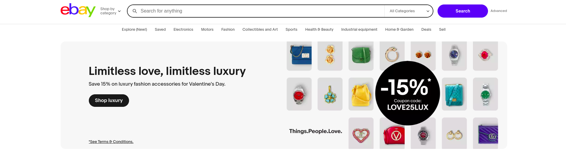
Example: Websites like eBay dynamically serve WebP images to supported browsers while falling back to traditional formats for others.
Implementation Tip: Use responsive images that adapt to screen sizes, reducing unnecessary data loads for mobile users.
Eliminating Render-Blocking JavaScript: JavaScript that loads before critical page elements delays rendering.
Example: Twitter defers loading non-essential scripts (like analytics and third-party widgets) until after the main content is visible.
Implementation Tip: Minimize third-party scripts, use async or defer attributes in JavaScript, and load fonts locally instead of fetching them from external servers.
Personalization Based on User Intent
Users expect tailored experiences. Generic content fails to capture attention, while personalized UX elements increase engagement by up to 80%.
AI-Driven Dynamic Content Recommendations: Showing relevant content based on past behavior increases session duration.
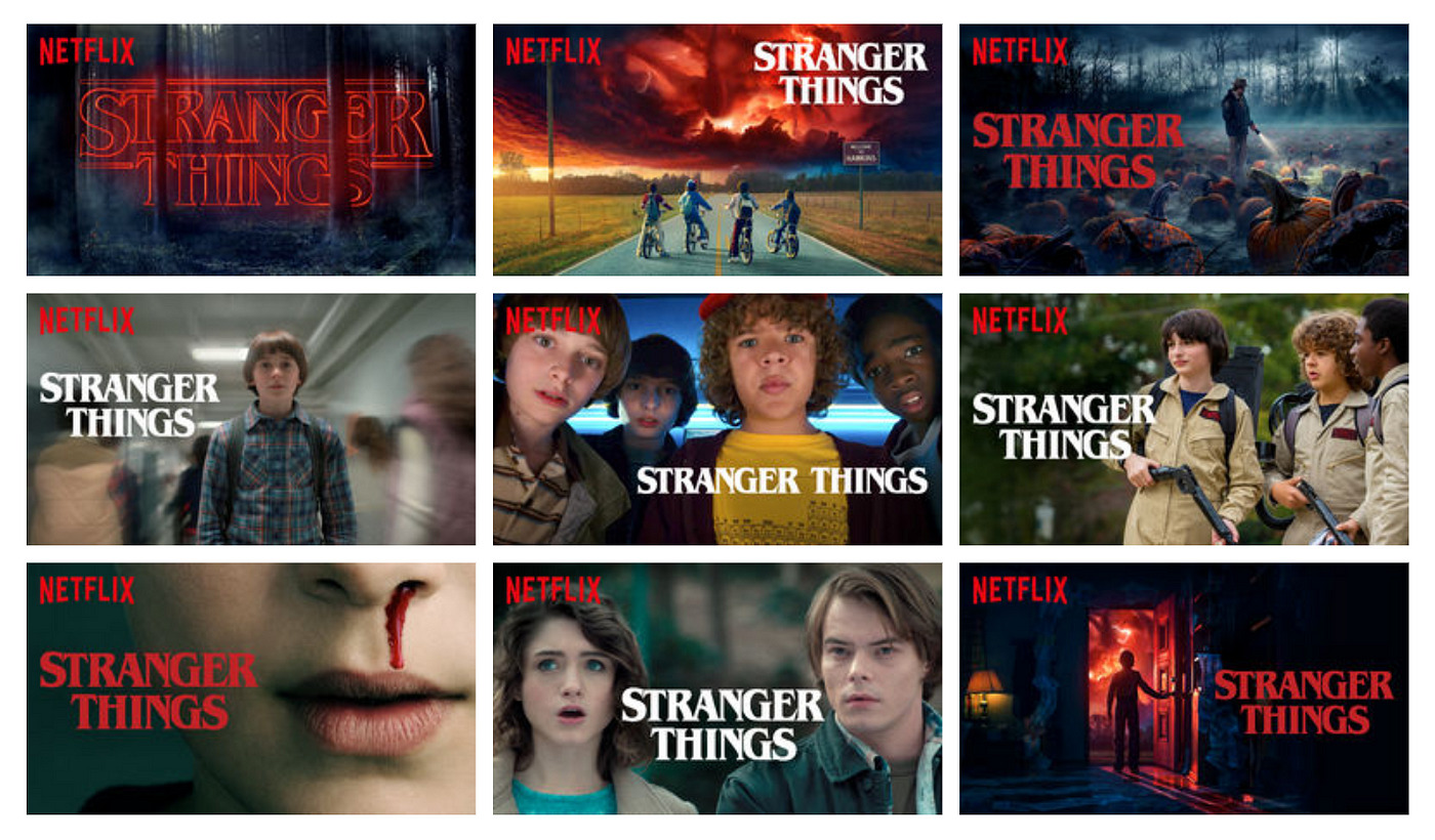
Example: Netflix doesn’t just recommend content; it customizes thumbnails, descriptions, and ranking order based on each user’s watching patterns.
Implementation Tip: Use machine learning to analyze browsing behavior and dynamically adjust content recommendations.
Behavioral Targeting for Returning vs. New Users: First-time visitors and repeat users have different needs.
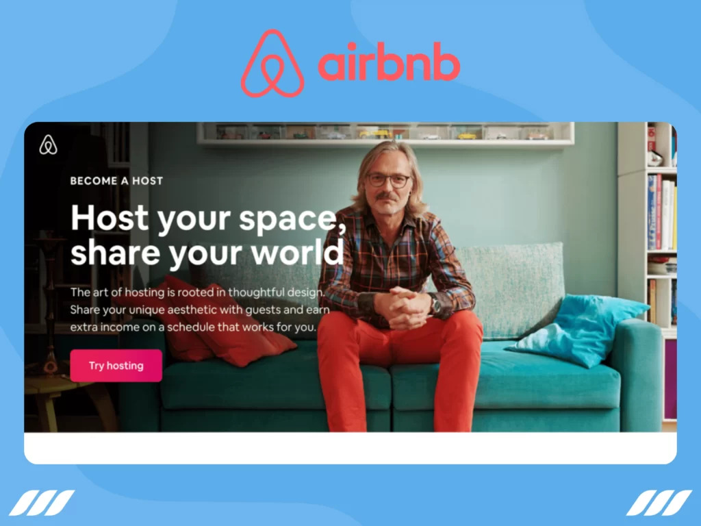
Example: Airbnb personalizes homepage content based on whether a user is a first-time visitor, a frequent traveler, or a host.
Implementation Tip: Create custom landing pages for different user segments based on referral source, location, and past interactions.
Navigation & Information Architecture That Guides Users
Confusing navigation leads to frustration. A well-structured site keeps users engaged by making discovery intuitive.
Hick’s Law: Reducing Choice Paralysis: More choices lead to slower decision-making.
Example: Apple’s website keeps primary navigation minimal, focusing on a few core categories rather than an overwhelming menu.
Implementation Tip: Group similar options, limit choices per menu and provide a predictive search to help users find what they need faster.
The Von Restorff Effect: Users remember things that visually stand apart.
Example: Spotify highlights its “Premium” CTA using high-contrast colors, drawing immediate attention.
Implementation Tip: Use color, size, and positioning to differentiate CTAs from secondary elements.
Context-Aware Navigation: Dynamic navigation adjusts based on where the user is in their journey.
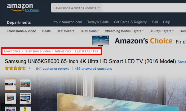
Example: Amazon’s breadcrumb navigation helps users trace their path while browsing categories.
Implementation Tip: Implement sticky headers, breadcrumb trails, and contextual menus to make navigation effortless.
Content Structure and Readability Enhancements
Users don’t read web pages word for word; they scan for relevant information. Poor readability forces them to leave, while well-structured content keeps them engaged.
Designing with F-Pattern and Z-Pattern Layouts: Eye-tracking studies show that users scan pages in predictable patterns. The F-pattern is common on text-heavy pages, where users focus on the first few lines and then scan down the left side. The Z-pattern is more effective for visually driven pages, guiding users from the top left to the top right, then diagonally across to the bottom.
Example: Medium structures blog content using the F-pattern, ensuring key takeaways are positioned where users naturally look. Landing pages for SaaS tools often use the Z-pattern, placing CTAs in high-visibility areas.
Implementation tip: Arrange content so that the most critical information appears where users are most likely to notice it. Headlines, subheadings, and visuals should follow the expected scanning behavior.
Breaking Up Content for Better Readability: Dense blocks of text are intimidating, especially on mobile devices. Well-structured content with whitespace, short paragraphs, and varied formatting increases engagement.
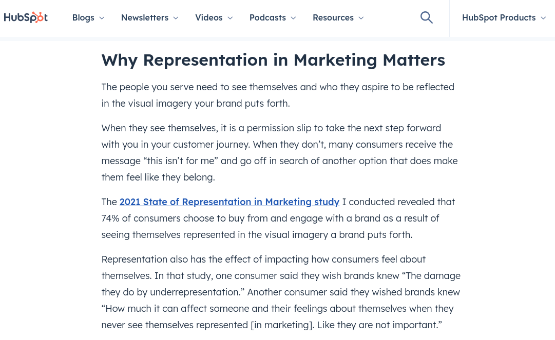
Example: HubSpot’s blog articles use clear subheadings, bullet points, and images to maintain readability, making it easy to scan without overwhelming users.
Implementation tip: Limit paragraphs to three or four sentences, incorporate whitespace to prevent visual clutter, and use numbered lists or bullet points to summarize key ideas.
Using Structured Data to Enhance Content Discovery: Search engines favor well-structured content. Implementing structured data (such as FAQ schema) makes content more discoverable in search results while also improving on-site readability.
Example: Recipe sites use structured data to display cooking time, ingredients, and user ratings directly in search results, reducing bounce rates by setting expectations before users even click.
Implementation tip: Use schema markup for FAQs, articles, and product pages to provide context to search engines and improve search visibility.
Interactive UX to Sustain Engagement
Static pages feel passive, while interactive elements encourage users to engage, reducing bounce rates.
Using Microinteractions for Seamless Guidance: Microinteractions are small, subtle animations or feedback mechanisms that make interactions feel smoother. They help users understand what’s happening without disrupting their experience.
Example: LinkedIn’s "typing indicator" in chat reassures users that a response is coming, reducing drop-offs. Airbnb highlights filters when users hover over them, guiding the decision-making process.
Implementation tip: Introduce hover effects, button animations, or subtle loading indicators to create a smoother, more intuitive experience.
Implementing AI-Driven Conversational Interfaces: Users often bounce when they can’t find answers quickly. Chatbots and AI-driven assistants help by providing real-time guidance.
Example: Sephora’s chatbot assists users in finding the right beauty products by asking personalized questions, reducing frustration and improving session duration.
Implementation tip: Implement a chatbot that provides contextual support based on the user’s journey rather than using a generic, pre-programmed script.
Reducing Friction in Conversion Paths
Every additional step in a process increases the likelihood of abandonment. Reducing friction in conversion paths ensures that users move seamlessly from interest to action.
One-Click Checkouts and Simplified Forms: Complicated checkouts are a major cause of high bounce rates. Streamlining the process reduces friction.
Example: Amazon’s one-click checkout eliminates unnecessary steps, making it easy for returning customers to complete purchases instantly.
Implementation tip: Reduce the number of required form fields, enable autofill, and allow guest checkout options to minimize resistance.
Eliminating Unnecessary Steps in Signup and Login: Long-winded signup forms or mandatory account creation can frustrate users.
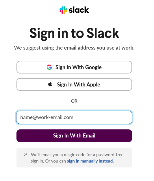
Example: Slack allows users to sign up using Google or other SSO options, speeding up the process.
Implementation tip: Implement social logins, one-tap authentication, and progressive form-filling to make the process as effortless as possible.
Exit-Intent Strategies That Provide Value: Instead of using aggressive pop-ups, smart exit-intent strategies can retain users by offering timely incentives.
Example: Booking.com detects when a user is about to leave and offers limited-time discounts to encourage conversion.
Implementation tip: Use exit-intent overlays that provide value, such as a free resource, discount, or helpful guide, rather than disruptive, generic pop-ups.
Mobile UX Optimization Beyond Just Responsiveness
A responsive design isn’t enough—mobile users require interactions tailored to touch-based navigation and varying screen sizes.
Gesture-Based Navigation for Fluid Interactions: Tapping, swiping, and pinching feel more natural than clicking buttons on mobile. Implementing gesture-based interactions improves usability.
Example: Instagram’s intuitive swipe gestures for navigating between stories keep users engaged, reducing bounce rates.
Implementation tip: Use swipeable carousels, tap-friendly elements, and long-press interactions to create a mobile experience that feels seamless.
Prioritizing Tap-Friendly Design Over Traditional Dropdowns: Traditional dropdown menus can be frustrating on mobile, requiring extra taps to access essential options.
Example: Google Maps uses bottom sheets instead of dropdowns, allowing users to swipe up for more options without losing context.
Implementation tip: Replace dropdowns with expandable sections, thumb-friendly buttons, and larger touch targets to improve usability.
Leveraging Trust Signals and Social Proof
Users hesitate to engage if they don’t trust a website. Visible credibility markers reassure them and increase conversions.
Trust Badges, SSL Certificates, and Clear Privacy Policies: Users are cautious about sharing personal information. Displaying trust signals builds confidence.
Example: Shopify prominently displays security badges at checkout to reduce abandonment rates.
Implementation tip: Show trust indicators like SSL certificates, money-back guarantees, and privacy policies in visible areas.
Live Social Proof and FOMO Elements: Real-time social proof increases perceived trust and urgency.

Example: Booking.com shows “Only 5 rooms left ” notifications, creating urgency and reducing indecision.
Implementation tip: Implement live activity notifications and customer review highlights to reinforce trust and credibility.
Customer Testimonials, Case Studies, and Credibility Markers: Users trust peer reviews more than brand claims.
Example: Platforms like HubSpot showcase customer case studies to validate their product’s effectiveness.
Implementation tip: Feature authentic customer reviews, before-and-after case studies, and well-known client logos to build credibility.
Eliminating Disruptive Elements That Drive Users Away
Certain UX elements actively discourage users from staying on a site. Removing these barriers can significantly reduce bounce rates.
Intrusive Pop-Ups and Autoplay Videos: Full-screen pop-ups that appear immediately frustrate users, especially on mobile.
Example: Google penalizes mobile sites with intrusive pop-ups, ranking them lower in search results.
Implementation tip: Use behavior-driven overlays instead of immediate pop-ups, ensuring they appear only when relevant.
Subtle, Behavior-Driven Overlays: Instead of blocking the entire screen, smart overlays provide value without disrupting the experience.
Example: The New York Times offers subtle subscription prompts that blend into the reading experience rather than interrupting it.
Implementation tip: Display pop-ups based on user behavior—such as after scrolling a certain percentage or upon exit intent—rather than immediately upon arrival.
Measuring & Iterating for Continuous UX Optimization
Reducing bounce rates isn’t a one-time fix—it’s an ongoing process of measuring, analyzing, and refining your UX. The most effective teams continuously test new ideas, collect data, and iterate based on insights. This section covers advanced methods to track engagement, refine UX through testing, and leverage AI for predictive improvements.
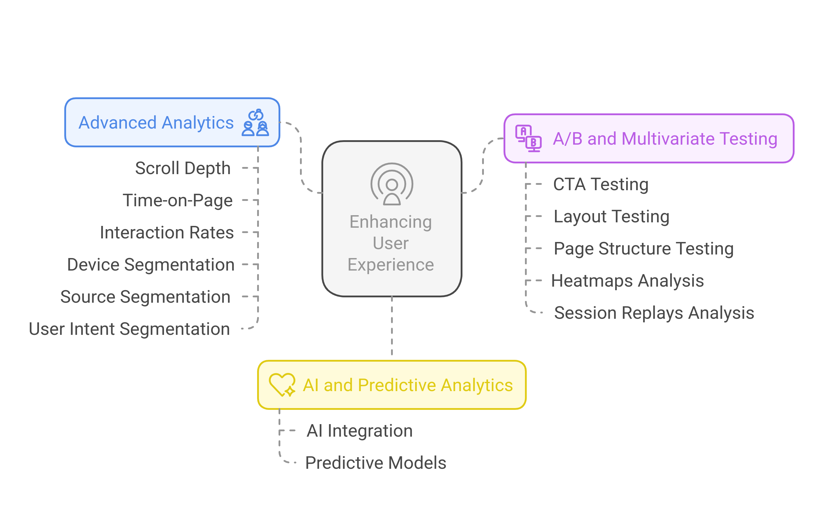
Using Advanced Analytics to Understand Bounce Rate
Basic bounce rate metrics don’t tell the full story. A high bounce rate on a landing page might indicate a problem—or it might simply mean users found the information they needed quickly. To separate false alarms from real issues, deeper analytics are necessary.
Tracking Scroll Depth, Time-on-Page, and Interaction Rates
A user who bounces after reading an entire article is very different from one who leaves after three seconds. Traditional bounce rate metrics don’t capture this nuance.
Implementation Tip: Use Google Tag Manager to track scroll depth and interaction events. Set up triggers for key engagement signals, such as scrolling past 50% of the page or clicking on interactive elements.
Segmenting Bounce Rate by Device, Source, and User Intent
Analyzing bounce rates in isolation won’t reveal patterns. Breaking them down by traffic source, device type, and user behavior helps pinpoint UX issues.
Implementation Tip: Use Google Analytics 4’s Explorations feature to compare bounce rates across user segments. Identify trends, such as higher bounces from paid traffic versus organic traffic, to refine targeting and landing page experience.
A/B Testing & Multivariate Testing for UX Refinement
Even minor tweaks in design, content, or CTAs can dramatically impact engagement. A/B and multivariate testing help identify what works best.
Testing Different CTAs, Layouts, and Page Structures
Different audiences respond to different designs. A simple CTA tweak—like changing “Get Started” to “Try for Free”—can improve conversions.
Implementation Tip: Use tools like Google Optimize or Fragmatic to test CTA text, button colors, content placement, and navigation styles.
Analyzing Heatmaps & Session Replays to Identify Friction Points
Heatmaps show where users are clicking, scrolling, or getting stuck. Session recordings provide a firsthand look at how users navigate a site.
Implementation Tip: Use Hotjar to analyze user interactions and detect areas where engagement drops. If users consistently rage-click on an element, it’s a red flag that needs fixing.
Conclusion
Reducing bounce rates isn’t about tricking users into staying longer—it’s about creating an experience that naturally holds their attention. High bounce rates are often a symptom of deeper UX inefficiencies, from slow loading times to misaligned content and friction-filled navigation. By taking a strategic approach—optimizing first impressions, refining content structure, enhancing interactivity, and leveraging AI-driven personalization—you can turn fleeting visits into meaningful engagements.
However, no UX strategy is ever truly "finished." User behavior evolves, technology shifts and new design trends emerge. The key to long-term success lies in continuous measurement, experimentation, and iteration. By using advanced analytics, A/B testing, and predictive modeling, you can refine your UX strategy over time and stay ahead of user expectations.
Ultimately, a great user experience isn’t just about reducing bounce rates—it’s about building trust, delivering value, and keeping users coming back. Start implementing these strategies today, and watch as engagement, conversions, and customer satisfaction rise.


